
Designing and Building an AI Journal That Doesn't Talk First
macOS App Design and Development


Visual Identity & Design System
Company
Storyteq | Creative automation platform for marketing at scale
Clients
Heineken, McDonald's, KFC, Henkel, Mars, and more
Challenge
Architect an enterprise design system from scratch without disrupting complex workflows that enterprise clients depended on daily
My Role
Sole owner of the design system: visual language, component library, and standards across 3 platforms.
Impact
Redefined brand identity, established consistency across a complex product, and shifted team culture from developer-led processes to collaborative, user-centric thinking
The Challenge
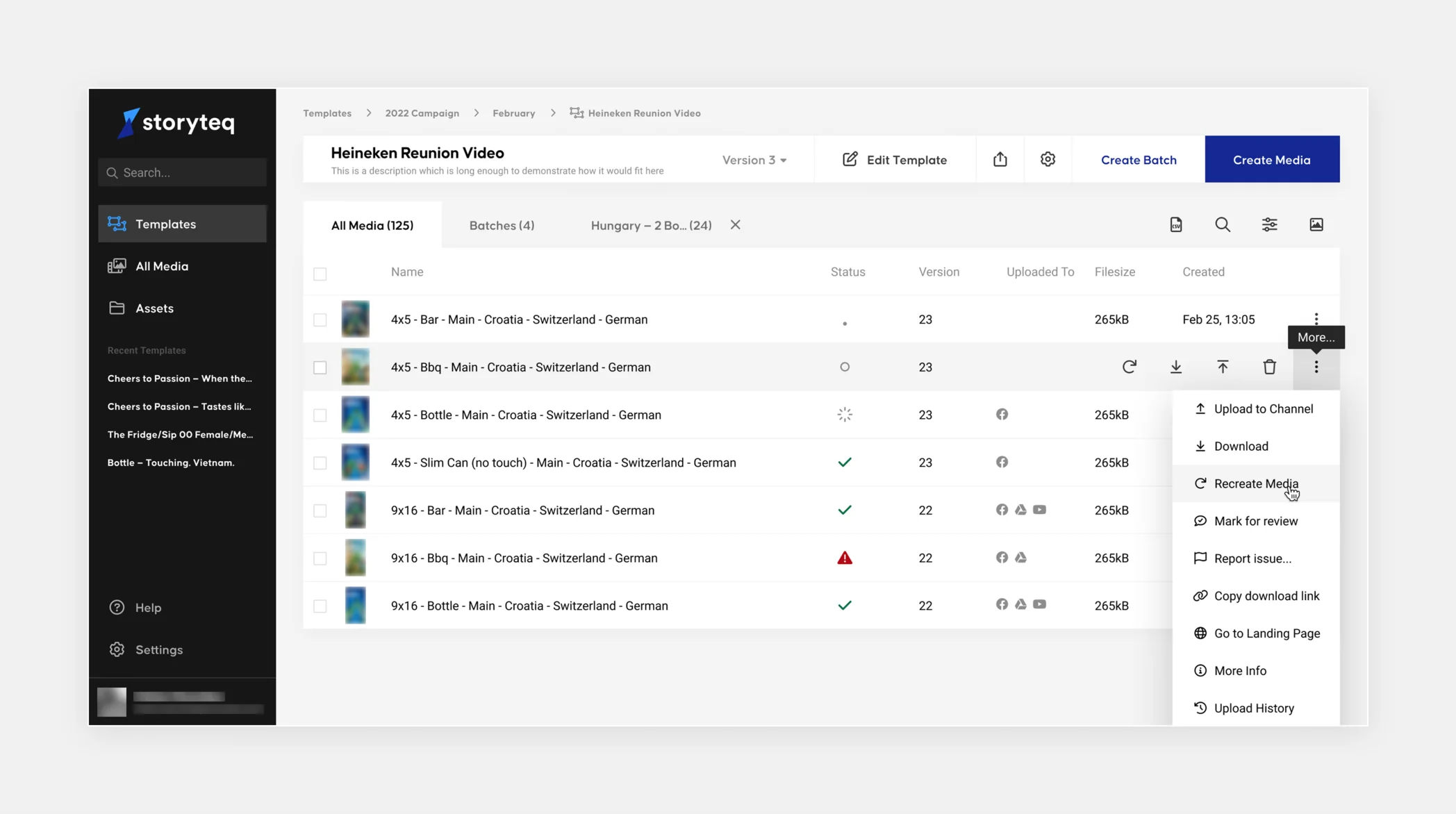
As Storyteq grew from startup to scale-up, the product showed its origins. Inconsistent UI patched together over time, with no coherent system underneath it.
The stakes were high: enterprise clients like Heineken and McDonald's relied on complex, niche workflows every day. A disruptive overhaul wasn't an option. The system had to evolve without pulling the floor out from under them.
Constraints
The constraint that shaped every decision
"If something works, don't break it"
Shifting How the Team Worked
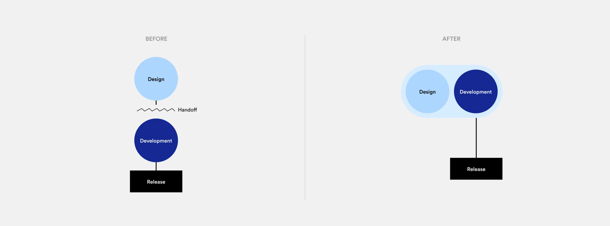
Before I joined, design and engineering worked in sequence: designers solved, developers built. Problems stayed siloed. Decisions got made without the people who'd implement them.
I ran collaborative sessions that brought both disciplines into the same room and eventually the same desk. Designers and developers attended the same meetings, worked through the same problems together. Every new challenge became a shared one.
This wasn't just a process change. It increased design maturity across the team and created a culture where feasibility and user needs were considered together from the start, not after the fact.
Research & Validation
I used Hotjar to map common flows and user behavior across the platform, validating assumptions with real usage data before making design decisions. This was especially critical given the constraint: I needed to know what was actually working before deciding what to change.
Introducing Consistent Patterns
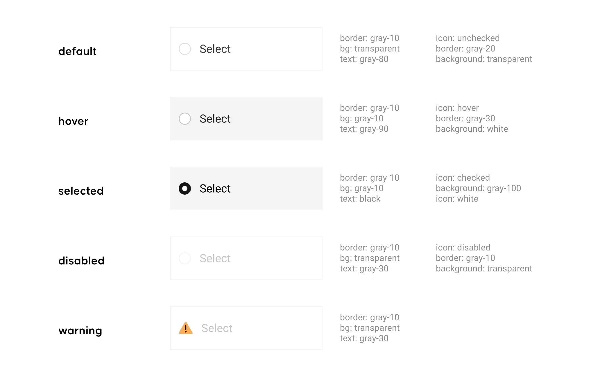
Rather than rebuild from scratch, I introduced consistent patterns that made the platform more learnable across its complexity.
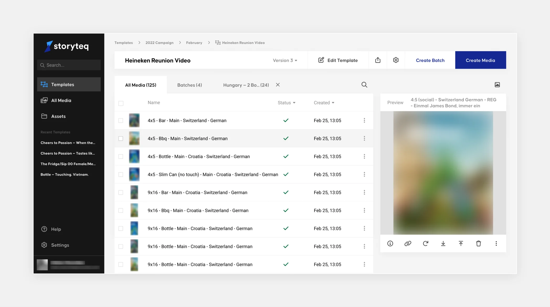
One key pattern I established was the "control strip", a top bar on overview pages that standardized navigation, version control, and primary actions across the app. One pattern, applied consistently, made the whole product feel more coherent.

A Deliberate Visual Direction
The visual direction was contested. The obvious path was a friendly, approachable aesthetic, rounded corners, soft tones, the look most of our competitors had already adopted. It tested well with general audiences and felt safe.
I argued against it. Storyteq's users weren't general audiences. They were marketing teams at Heineken and McDonald's running hundreds of campaigns simultaneously. What they needed wasn't warmth. They needed precision, clarity, and a UI that got out of their way.
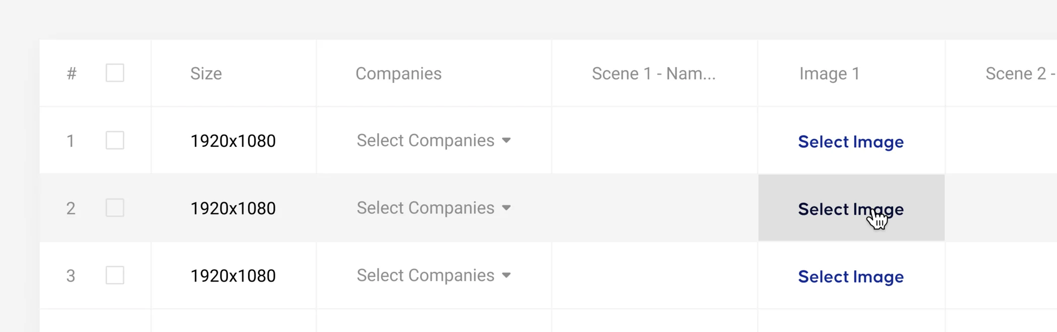
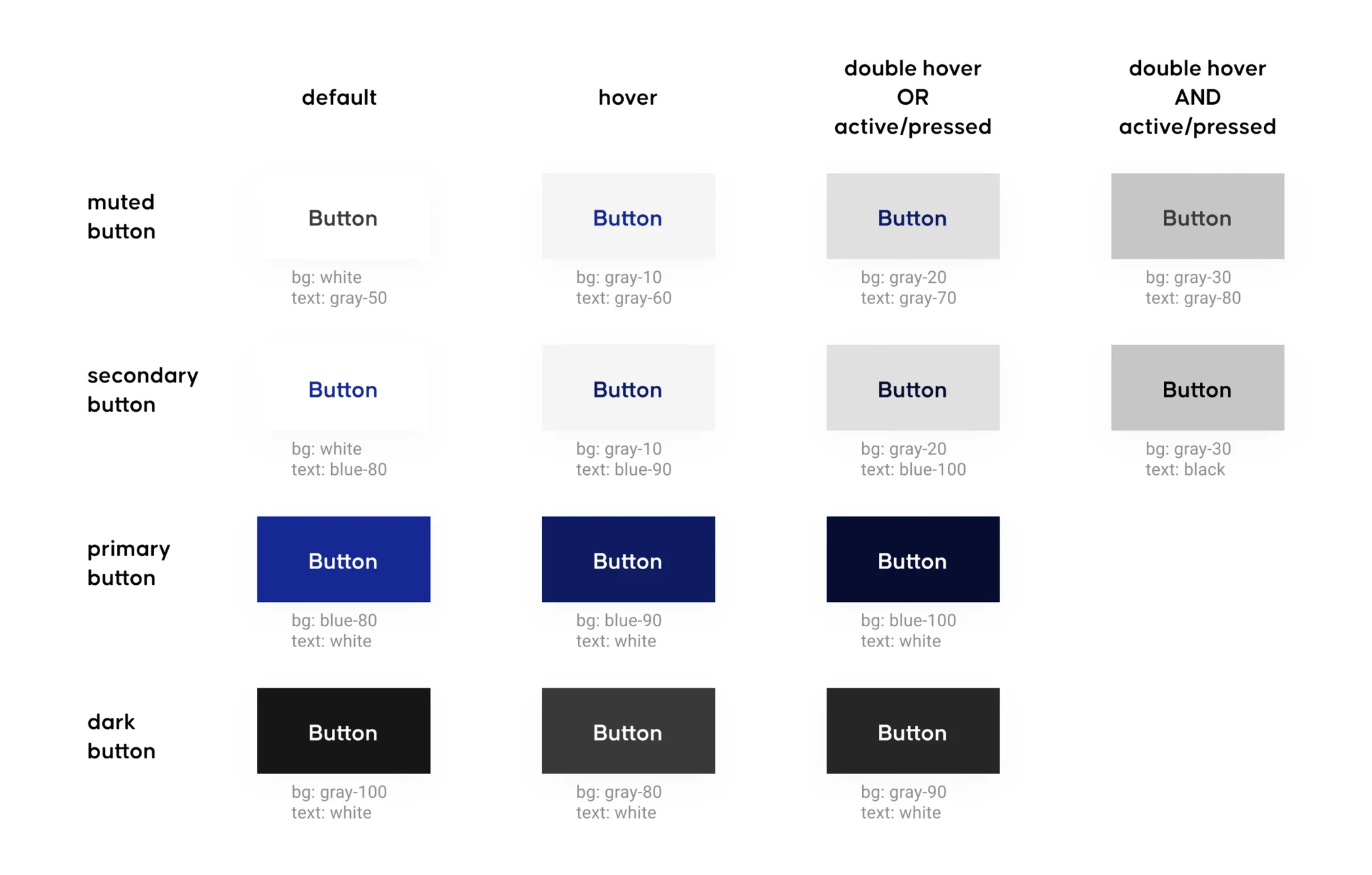
I pushed for a flat aesthetic with 0px corner radiuses and a strict 10px spacing grid. Every edge aligned perfectly. Far from alienating enterprise users, the tightness of the system matched how they actually worked. It gave the platform a distinct identity that reflected the seriousness of the work happening inside it.

The Impact
The design system redefined Storyteq's brand identity and established visual consistency across a complex, multi-platform product without disrupting the workflows enterprise clients depended on.
Beyond the system itself, the team left the project working differently. Design and engineering were no longer two separate phases. They were one process.
macOS App Design and Development
 viktorpeschka
 AmsterdamNL