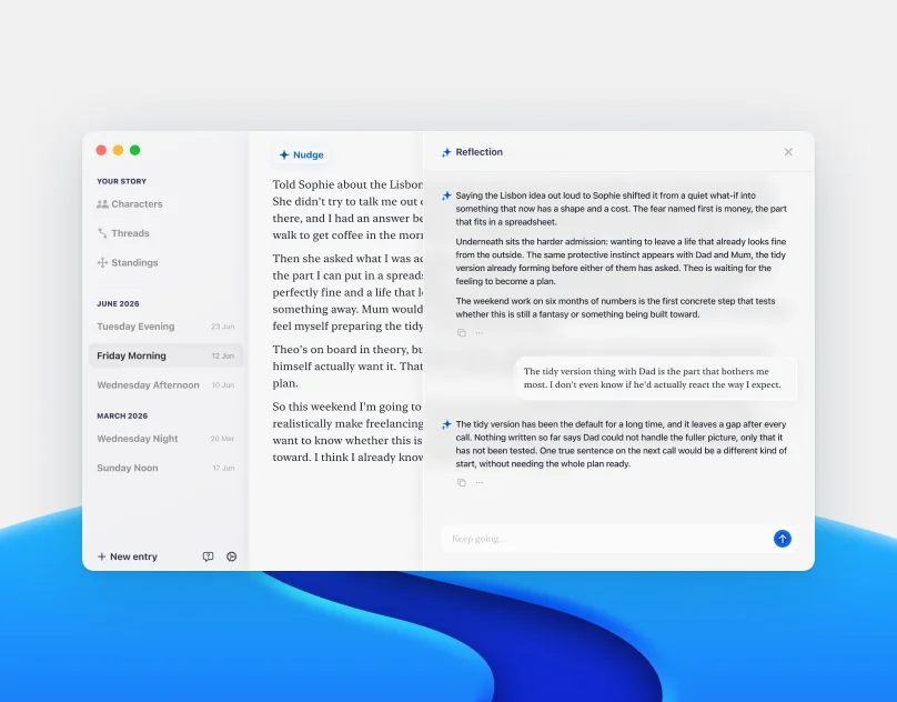

Designing and Building an AI Journal That Doesn't Talk First
macOS App Design and Development


Website Design & Frontend Development
Company
Trans Europe, official distributor of Wacom and Adobe in Central Europe
Challenge
Outdated site, expanding product lineup, and a brief that turned out to be asking for the wrong thing
My Role
Solo designer and frontend developer, collaborating with a backend developer
Impact
Launched a cohesive, scalable site that a non-technical team could maintain independently from day one
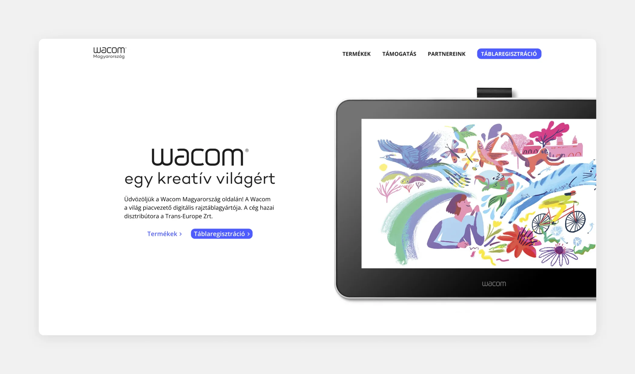
The Brief vs The Reality
The original brief pointed toward a straightforward e-commerce site. A product catalog, a way to buy, the standard approach for a distributor.
Before committing to that direction, I spoke with the customer support and sales teams who worked with actual users every day. What they described was a more complex picture. Users could not buy directly. The site needed to educate and guide purchase decisions without completing them. And the audience was not just consumers: partners and resellers needed it as a resource to keep their own sites current.
The research reframed the entire project. Not less work, but fundamentally different work.
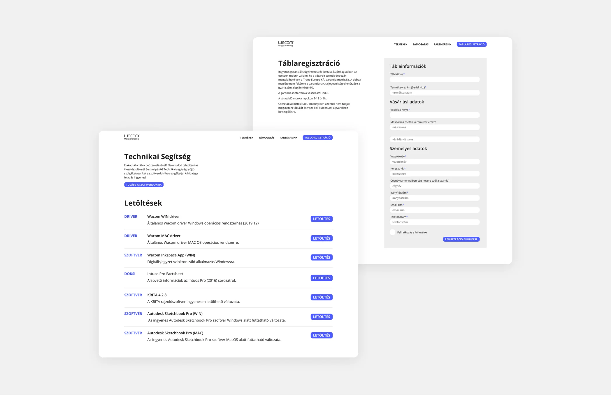
Designing for Three Audiences
Three distinct audiences, one site. The navigation had to route each of them to what they needed without making any of them feel like a secondary consideration.
Each path was clear from the homepage. The goal was that none of the three audiences would ever feel like they had arrived at the wrong site.
Defining the Visual Direction
Wacom's own brand is playful and expressive, built around hand-drawn illustrations and a consumer-facing warmth. Aligning with that was the obvious starting point, and we considered it seriously.
I pushed for a different direction. This site was not primarily a consumer portal. It served three audiences simultaneously, including partners and resellers who needed to extract accurate technical information efficiently. A playful, illustration-led aesthetic would have signaled the wrong thing to two of the three people arriving at the site.
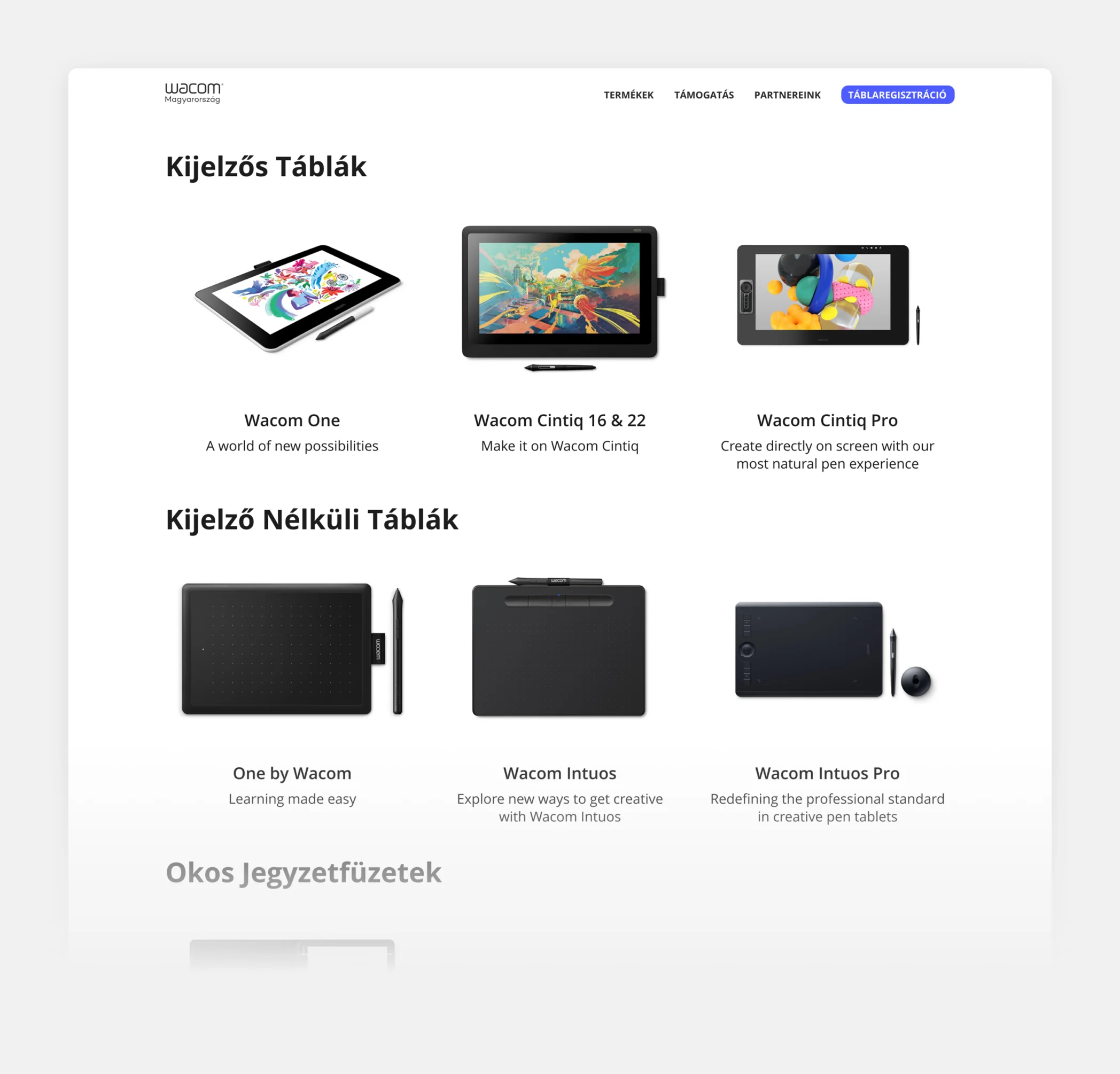
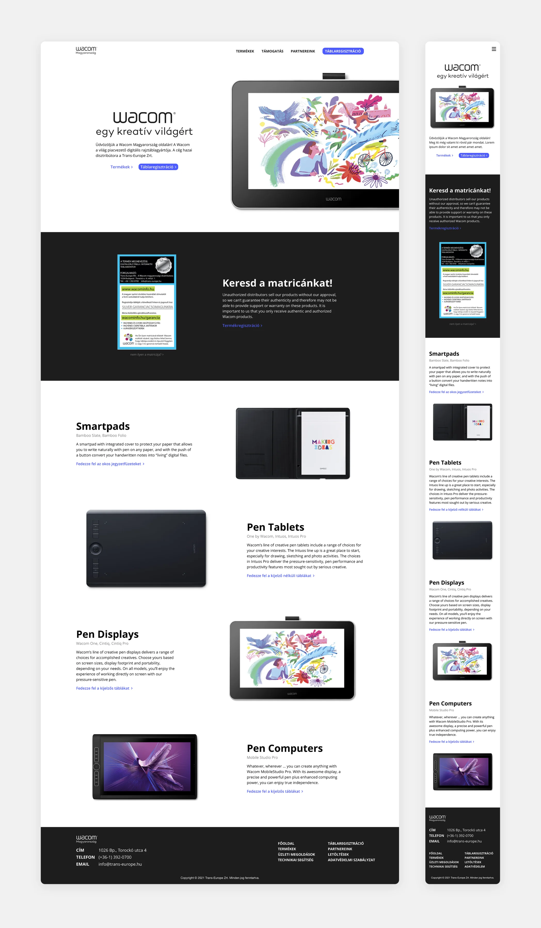
The direction I argued for was clean, spacious, and precise. Generous white space, minimal ornamentation, and product photography carrying the visual weight. Clear over expressive. The products were the most compelling thing on the page, and the design had to get out of their way.
Core idea
The products are the main stars
Designing the Constraints
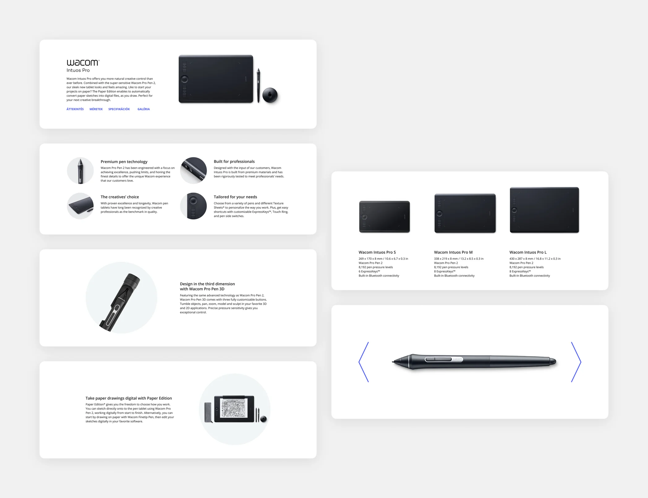
The marketing team responsible for maintaining the site were often students on summer placements. They needed to create and update product pages without any design or development support. I proposed a modular template system with intentional constraints built in: locked section order, enforced image sizing, automatic image positioning, and consistent backgrounds.
The team pushed back. They wanted creative freedom, the ability to make layout decisions themselves and adapt pages to individual products. It was a reasonable argument.
I pushed back harder. Creative freedom without design knowledge produces inconsistency. Every page would drift from the last depending on who built it and what mood they were in that day. The constraint system was not there to limit them. It was there to make the right result achievable by anyone, without studying the system or second-guessing decisions. They would not need to think about image positioning because the system would handle it. They would not need to judge section order because it was already determined. The structure was the support.
They came around. And once they started using it, the original objection disappeared.
Core idea
Constraints protect consistency
The Impact
The site launched with a cohesive visual identity and a system that worked without a designer in the room. Within days, the marketing team had independently created over 40 product pages, uploading all content themselves without design or development support.
Before this, updating the site required contacting a specific backend developer and waiting. After, the team had full autonomy over the product catalog.
The constraint system did exactly what it was designed to do: it made the right output the only output.
macOS App Design and Development
 viktorpeschka
 AmsterdamNL